

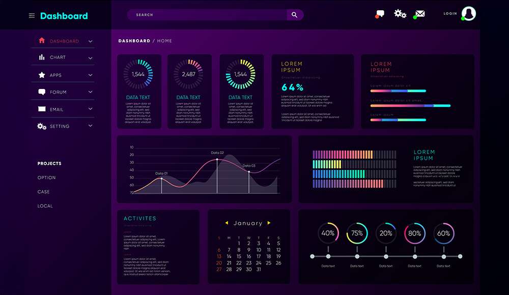
What is a Bento grid?
A Bento grid is a modular layout pattern that arranges content into visually distinct tiles of different sizes to establish clear hierarchy, faster scanning, and flexible composition across viewports; it borrows the compartmentalized structure of a bento box to balance asymmetry with order so primary tiles command attention while secondary tiles remain instantly discoverable. Unlike rigid equal-column dashboards, a Bento approach embraces structured variation—large hero tiles for KPIs, medium analytical tiles, and compact utility tiles—so information density increases without turning the layout into noise, which is especially beneficial for monitoring, triage, and mixed-content surfaces common in AI products.
Hire a Designer
Why Bento fits AI dashboards
AI dashboards unify predictions, confidence, explanations, data quality, alerts, and actions; Bento grids let each of these roles live in a purpose-built tile with specific affordances, reinforcing mental models and making it obvious where to look first and where to act next. Because AI surfaces evolve as models retrain and signals shift, tiles can be added, removed, or resized independently without redesigning the entire page, which preserves layout stability for users while giving teams room to iterate on the information architecture with minimal disruption.
Core layout principles
-
Grid foundation: Start with a 12-column grid on desktop and a 4-column grid on tablet/large mobile; set consistent gutters and margins so tiles snap to a predictable rhythm and alignment stays crisp even as spans vary across rows.
-
Structured asymmetry: Establish focal points with 2–3 larger tiles in the first viewport height, then balance visual weight with smaller tiles arranged in clusters; this avoids a “patchwork” feel and guides the eye through a deliberate scan path.
-
Visual grouping: Cluster tiles by purpose—outcomes, drivers, operations, health—so users can scan within a conceptual lane; use consistent spacing and alignment to signal group membership without relying solely on color.
Information hierarchy for AI
-
KPI marquee: Dedicate a hero row to outcome metrics such as revenue lift, precision/recall, or cost per decision; include trend lines, thresholds, and deltas so an operator can assess direction and urgency at a glance before diving into details.
-
Model telemetry: Surface model version, data freshness, inference latency, and drift scores in dedicated tiles; these operational signals reduce time-to-diagnosis when performance changes and enable compliance-friendly transparency.
-
Explainability bands: Reserve medium tiles for top features, SHAP summaries, and counterfactuals with concise narratives; link to deep-dive views so insight seekers can expand without cluttering the main grid.
States, density, and rhythm
-
State matrix: Define empty, loading, partial, error, stale, and degraded states per tile; use skeletons for asynchronous loads and graceful fallbacks (e.g., last-known-good) to avoid blank spaces or jarring jumps during data refreshes.
-
Density tuning: Offer a global density toggle and optional per-tile density to serve both operators (compact, high-density) and executives (comfortable, summary-first); adjust typography and spacing tokens to maintain tap targets and readability.
-
Rhythm continuity: Enforce a limited set of corner radii, elevation levels, and spacing increments so tiles of different sizes feel like one system; subtle shadow tiers can indicate interactivity and stack depth without visual clutter.
Responsive behavior
-
Breakpoint strategy: Predefine span remaps for common breakpoints (e.g., 12→8→4 columns) to prevent awkward single-column cascades; ensure hero tiles collapse into prominent stacks while preserving the importance order.
-
Progressive stacking: Keep clusters intact when stacking on smaller screens so related tiles remain adjacent; this maintains conceptual continuity and reduces context switching on mobile.
-
Interaction scaling: Increase hit areas, simplify legends, and streamline tooltips for touch contexts; ensure charts reflow axes and labels to avoid truncation or illegible microvisualizations on small tiles.
Visual design patterns
-
Depth and affordance: Use reserved elevation for draggable/resizable tiles and interactive headers, while keeping analytics tiles flatter; tactile micro-shadows and focus rings communicate interactivity without overwhelming content.
-
Contrast and focus: Apply neutral backgrounds with strategic accent color for alerts and critical deltas, and avoid meaningful information purely via color; use constrained blur or glass effects sparingly to highlight without harming accessibility.
-
Micro-interactions: Animate tile expansion, pin/unpin, and filter changes with 150–250ms motions; prefer content-revealing transitions that reinforce spatial memory over ornamental animations.
AI-specific tile types
-
Prediction tile: Present the latest prediction, a sparkline of recent values, and a calibrated confidence band; include quick actions (approve, override, queue) so users can act inline when appropriate.
-
Alert triage tile: Aggregate threshold breaches with severity, ownership, and recommended actions; support snooze, assignment, and bulk resolution to streamline operations for on-call workflows.
-
Data quality tile: Track ingestion completeness, null rates, schema drift, and recent incidents; roll these into a health score to help non-experts interpret technical signals quickly.
Explainability and trust
-
Rationale tiles: Summarize top drivers with natural-language explanations, include evidence links, and show “why not” alternatives for a nearby outcome; this builds trust and aids troubleshooting when outputs defy expectations.
-
Provenance tiles: Display model lineage, last training time, dataset origin, and approval status, enabling audit-readiness and clearer handoffs during incident response or governance reviews.
-
Uncertainty UX: Represent uncertainty with intervals, density bands, or traffic-light states, and pair with textual qualifiers; avoid encoding critical meaning in color alone to remain accessible.
Interaction and customization
-
Layout editing: Support drag-resize and reorder within grid constraints, with snapping and collision rules to prevent broken compositions; provide undo/redo and a reset layout to restore sensible defaults.
-
Pinning and scoping: Allow pinning of high-priority tiles and per-tile filters (e.g., region, segment) that layer on top of global filters; show scope chips/badges so differences are transparent.
-
Templates and roles: Offer role-based presets for operators, analysts, and executives with curated tile sets and densities; templates reduce setup time and enforce best-practice information architecture.
Data visualization inside tiles
-
Compact charts: Favor sparklines, small multiples, and band plots that communicate trend, distribution, and uncertainty in constrained spaces; minimize legends by labeling series directly where possible.
-
Consistent scales: Normalize axes across related tiles to enable reliable comparisons; annotate anomalies with inline markers rather than separate legends to save space and reduce eye travel.
-
Tooltips and drilldowns: Use hover/tap tooltips for detail-on-demand and support expand-to-modal for full-screen exploration; avoid cramming full dashboards into small tiles, which harms legibility and performance.
Accessibility and performance
-
Keyboard and ARIA: Implement ARIA grid roles, keyboard reordering, and visible focus states; ensure all tile controls are reachable, labeled, and operable without a mouse.
-
Contrast and type: Meet WCAG contrast for text and interactive icons, and avoid ultra-light weights in data-dense contexts; scale typography systematically so titles, metrics, and annotations remain legible.
-
Performance budgets: Lazy-load offscreen tiles, stream incremental data for long queries, and debounce live updates; prioritize main-thread budgets to keep interactions smooth during frequent data refreshes.
Implementation notes
-
Figma setup: Use auto-layout with a 12-column and matching row grid to sketch compositions; create component variants for each tile’s states and test breakpoint behavior with constraints before handing off.
-
Frontend stacks: Build with CSS Grid and container queries; define grid-template-areas for repeatable presets, and use utility classes or tokens for consistent spacing and radii across tiles.
-
State management: Normalize tile state in a store and isolate data queries per tile to prevent cascading failures; implement backoff and retries with visual feedback so failures degrade gracefully.
Governance and evolution
-
Tile lifecycle: Tag tiles as proposed, experimental, stable, or deprecated, and display this metadata in a small governance tile so stakeholders understand maturity and risk.
-
Experimentation: A/B test tile sequences, spans, and densities; capture attention metrics, scroll depth, and action completion to iteratively refine the layout and information architecture.
-
Design tokens: Centralize spacing, color, elevation, and corner radii in tokens so new tiles automatically inherit system DNA; this ensures cohesion as the dashboard grows.
Common pitfalls
-
Decorative overload: Excess gradients, depth, or glassmorphism hurt legibility in data-dense contexts; prioritize clarity, contrast, and consistent visual language to maintain comprehension.
-
Tile sprawl: Too many small tiles fragment attention and create decision fatigue; cap visible tiles per screen and hide low-priority details behind expanders or tabs.
-
Inconsistent scales: Mismatched axes, units, or definitions across tiles break trust; establish shared metric contracts and validate them during development to avoid misleading comparisons.
Example layout blueprint
-
Top row: Outcome KPI tile with trend and confidence, Alert triage tile with severity and actions, and SLA/Latency overview tile to monitor operational health; these set priorities for immediate attention within the first viewport.
-
Middle cluster: Segment-level prediction tiles, Explainability summary with top drivers and counterfactuals, and a Data quality/drift monitor that rolls up health into a composite score for quick diagnosis.
-
Bottom row: Activity log of decisions and overrides, Recent deployments and model versions, and an Action queue with bulk resolution tools to support daily operations and incident response.
Bento grids provide a durable framework for AI dashboards by aligning modular tiles with prioritized outcomes, explainability, and operations while preserving responsiveness, accessibility, and performance; this combination makes high-signal monitoring and action faster and more trustworthy in evolving AI environments.